The Peel brand in action
Learn how we apply the brand in our everyday communications.
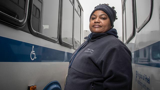
People of Peel stories
Every connection with a resident is personal.
People of Peel stories are as diverse as those who tell them. We feature those who are part of the Peel community. Profiles of our employees and the services they deliver help to further illustrate Peel Region's impact. Peel's brand comes to life when residents tell their stories in their own voices, and when employees, who aren't often seen, are spotlighted.
All stories:
- Showcase employee and resident pride through their own personal experience, giving true insight into our culture and those who cultivate it.
- Emphasize the difference our employees and residents make in Peel communities every day.
- Are authentic and relatable, making residents and employee's feel they "know" the people in the story.
- Are unique in their narrative, but alike in the emotional connection they create.
- Can be tailored to fit different formats and marketing channels.
Visit
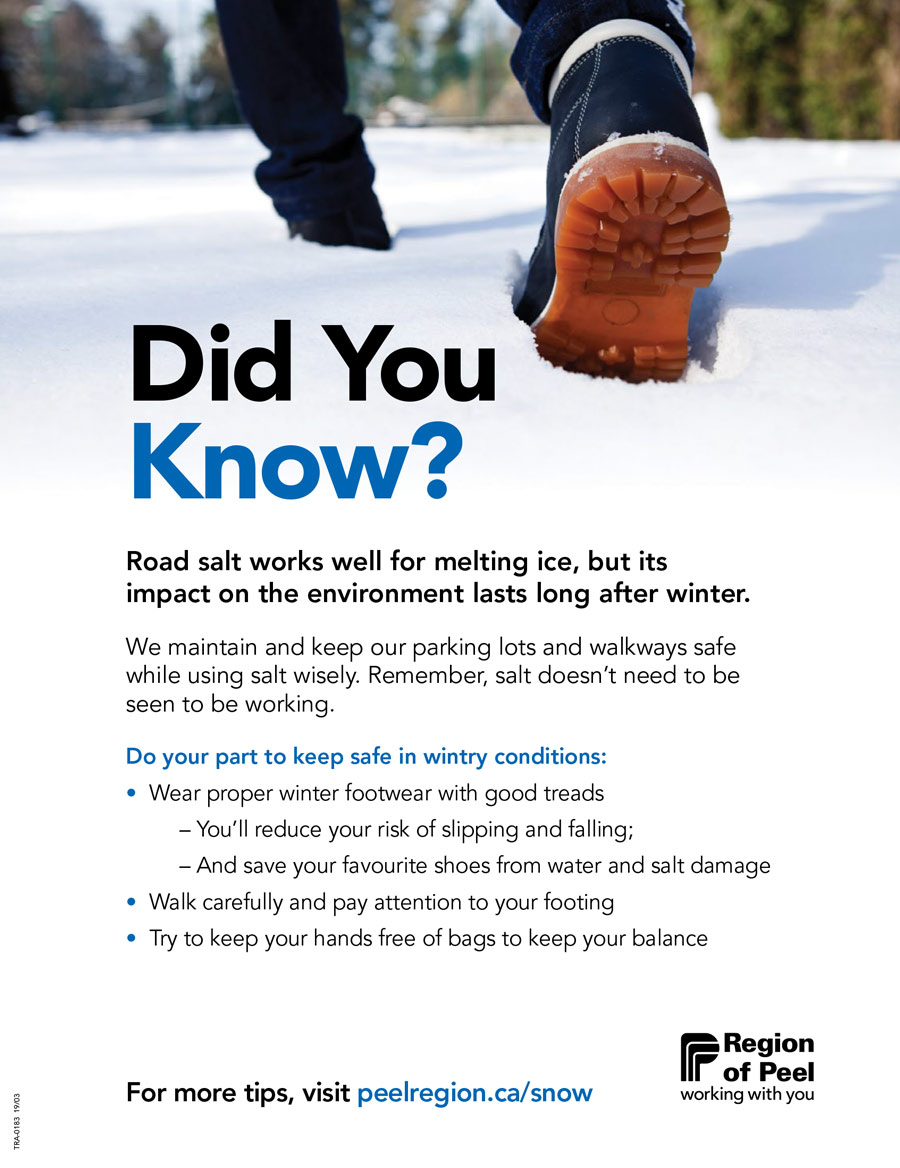
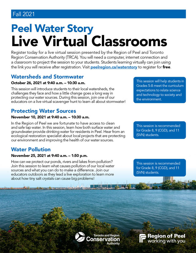
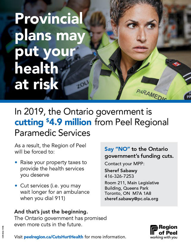
Peel brand layouts
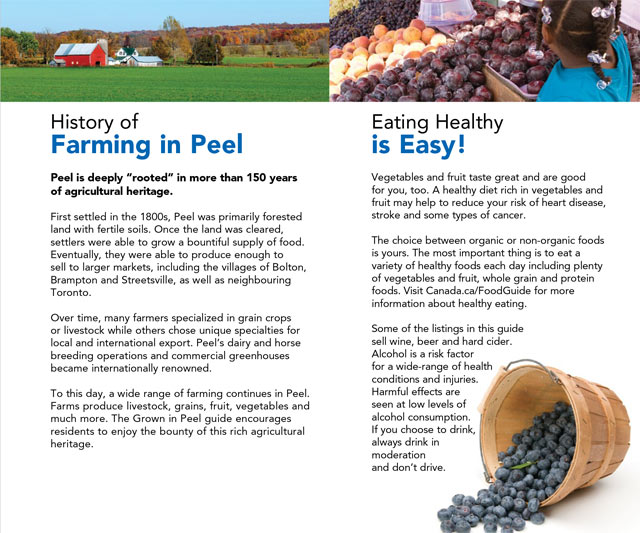
- Maintain a liberal amount of white space for clear readability.
- Use Avenir LT STD black as main heading font set in Peel blue or Peel blue and black combination.
- Use varying weights of Avenir LT STD to differential text elements.
- The Region of Peel logo should appear bottom right when possible.
- When fading an image out to white, integrate it into the scene like the transition to white snow at right.
- Text can knock out to white over an image if there is adequate contrast.
- Grey blocks can be used to offset text and create sidebars. Blue bars can be used as accents.
- Use a combination of full environment and close cropped imagery to add interest to the materials. For example, the sky fades subtlety out to white.
Download
Download
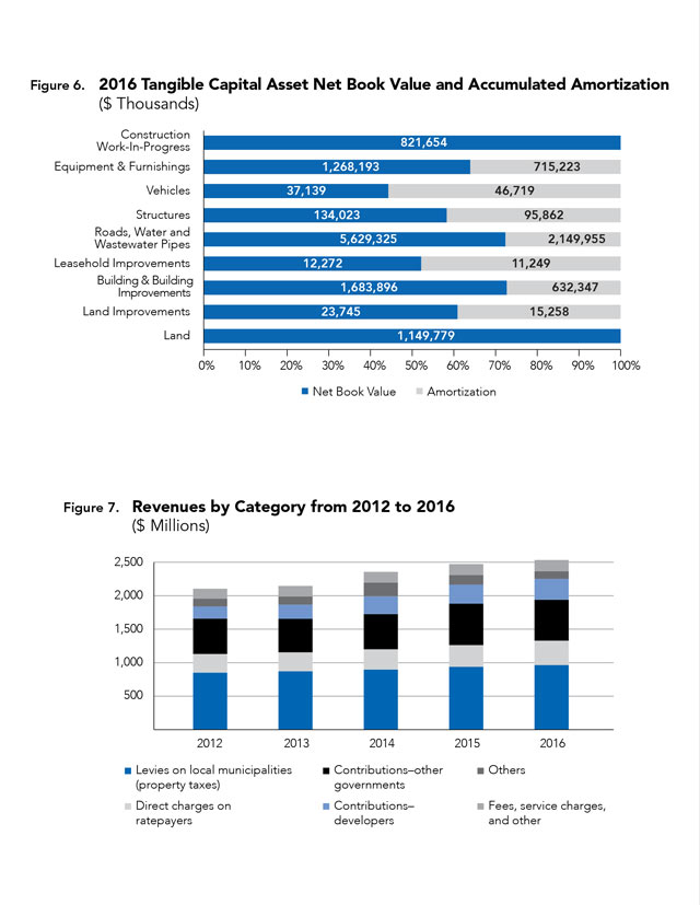
Charts and graphs
- Use a wide tonal range of our primary colours: Peel Blue and Peel Black.
- If you need to highlight certain data points, use the Peel highlight (Rust) and support colours (Gold, Teal, Purple or Light Teal)
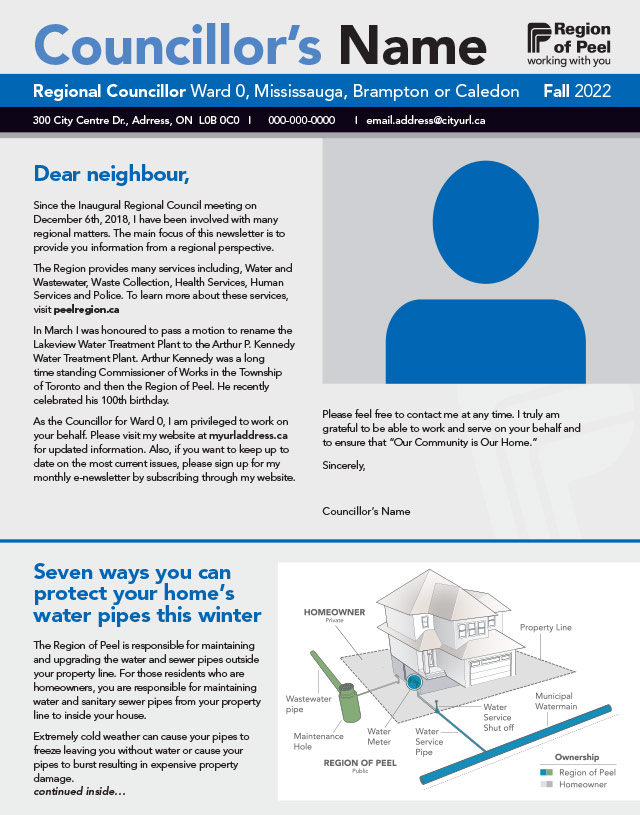
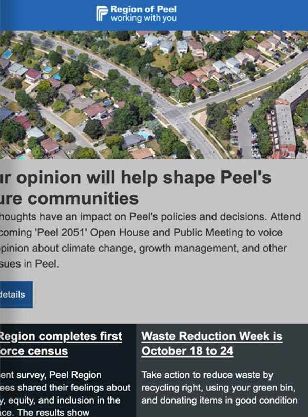
Councillor newsletters
Newsletters follow a similar treatment as other materials, with blocks of light grey and blue behind different stories to enhance readability.
Iconography and footers
Icons help convey information in a pictorial way. They represent an application, a capability, or a concept.
Peel Region icons:
- Are precise, contemporary, and exclusive
- Are credible and explanatory
- Should be a Peel Region primary colour – Peel Blue or Black or a secondary-colour grey
- Are only one colour in keeping with mobile device screen size and legibility
- Should have a consistent stylistic treatment within each piece of communication
Footer information:
- Should always be clear
- Should be uncluttered
Download
Digital signage
Digital signs are located at various Peel Regional facilities. They are considered an extension of our intranet and are used to inform frontline and non-desk employees about essential corporate news and updates.
Static image specifications include 1920 x 1080 GIF or JPEG files with a resolution of 300 pixels per inch. Copy should be concise and include a call to action when possible. Video requires 1080P MP4 files running no more than 15 seconds.
Advancing digital service delivery
Digitalizing processes and improving customer experience have been essential in advancing Peel’s digital service delivery.
Continuous enhancements to peelregion.ca lead to improved service delivery for residents, updated tools and support for employees, and optimized service processes.
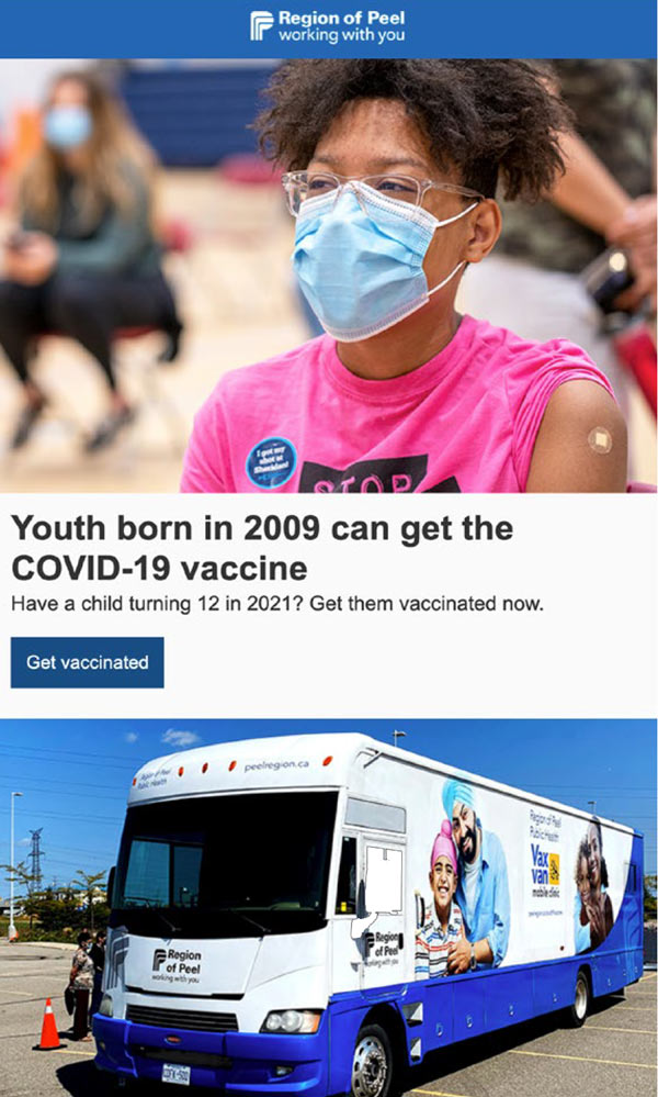
We use social media to share vital information and service updates, interact directly with residents and celebrate our community.
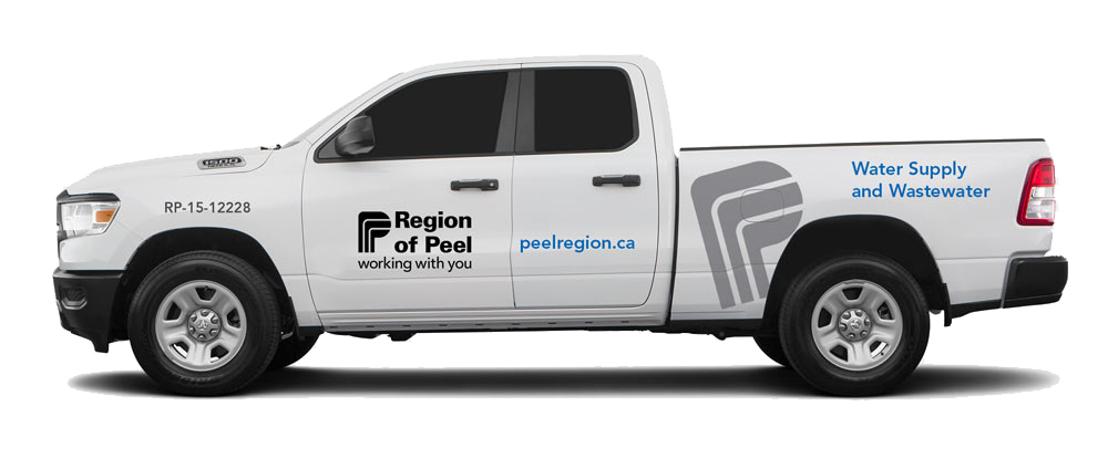
Fleet vehicles
Fleet vehicles are white with 4 brand elements. These elements vary in size depending on the type of vehicle. We use consistently sized elements for similar vehicle types; for example, pickup trucks and vans may have larger logos than cars.
1 Region of Peel logo
- The logo should appear in black on the driver and passenger doors as well as the back of the vehicle.
- It should be as large as possible while still maintaining the required surrounding whitespace.
- The stacked version of the logo is primary, but the horizontal version can be used when vertical space is limited.
2 Peelregion.ca URL
- The URL is always set in Avenir LT STD Black and should appear in Peel blue (Gerber/3M Vivid Blue 220-17 Cast Vinyl).
- Placement should be secondary to the logo.
3 Large P
- The large stylized P must appear in a light-to-mid grey ("PMS Cool Gray 2" or "3M Pearl Gray").
- The stylized P should be set on an angle, 15 degrees counter-clockwise from vertical, and as large as possible.
- The stylized P can be cropped off in areas, but must still be identifiable as the Region of Peel "P."
4 Services description
- To increase public awareness of the services offered by the Region of Peel, vehicles can include service names listed on the sides.
- The service name should appear towards the rear of the vehicle, set in Avenir LT STD Black weight in Peel blue.
- Text should be set flush left.
5 Other messaging
- Extra phrases such as "low emissions" should be set in Avenir LT STD Heavy in "PMS Cool Gray 9C" or equivalent.
- Use your discretion in size and placement, so these messages don't overpower the Region of Peel logo and other brand elements.
- Fleet or ministry numbers must be set in Avenir LT STD Heavy 100%K.
Download
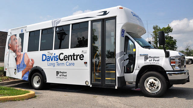
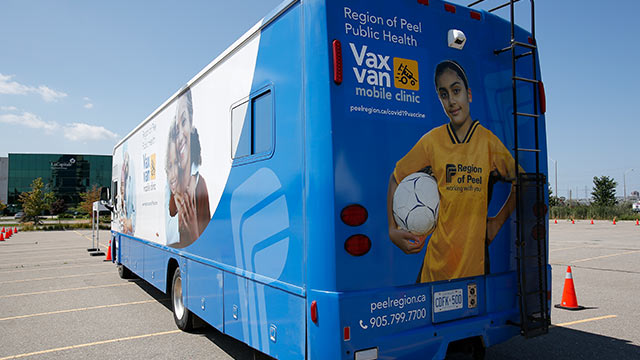
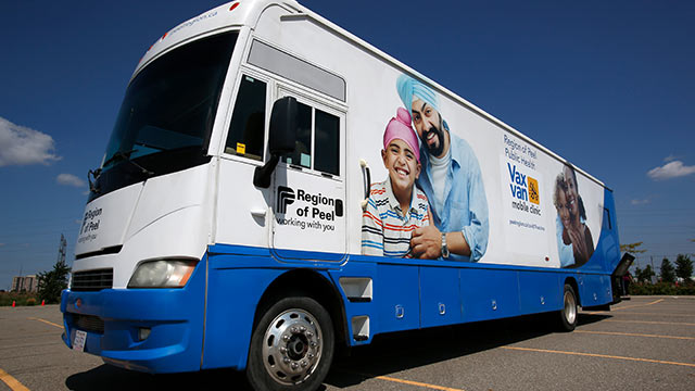
Specialized vehicles
For unique service vehicles:
- Maintain the black logo on the driver and passenger doors.
- Use a combination of brand colours and elements as required.
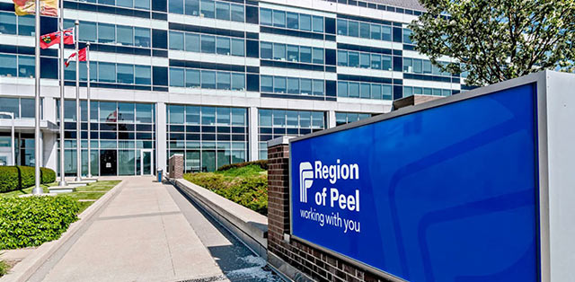
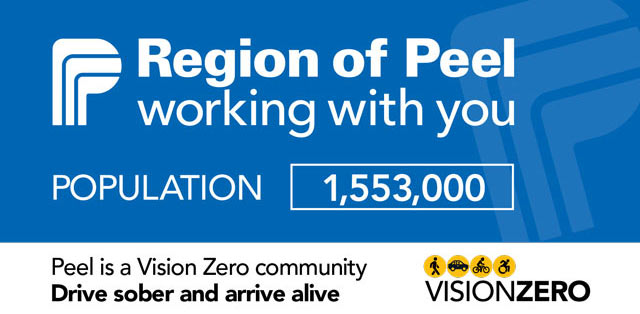
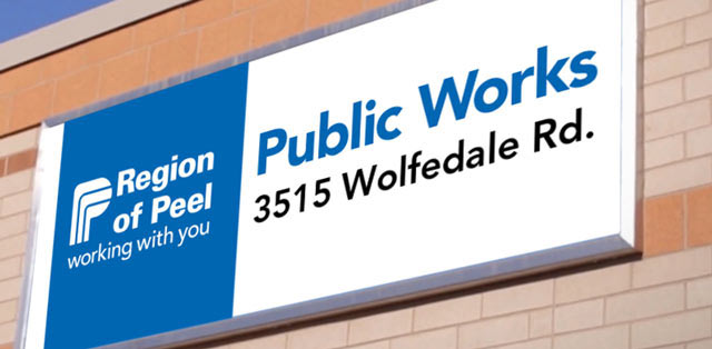
Exterior signage
We use a combination of white and Peel blue backgrounds with legible typography. Text can appear in white, black, or blue.
The stylized P can be used as a support design element and is normally on the right side and proportioned to bleed off slightly at the top, bottom, and side.
